Cycle Lane Counter Dashboard
Our newest dashboard published on Data Works is the Cycle Lane Counter Dashboard created using Power BI, this is a visual representation of the Cycle Lane Counter data that we already have published on Data Works.
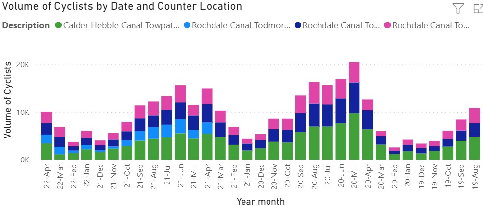
This dashboard includes a number of visualisations, including the volume of cyclists by month and the volume of cyclists at each of the four counter locations.
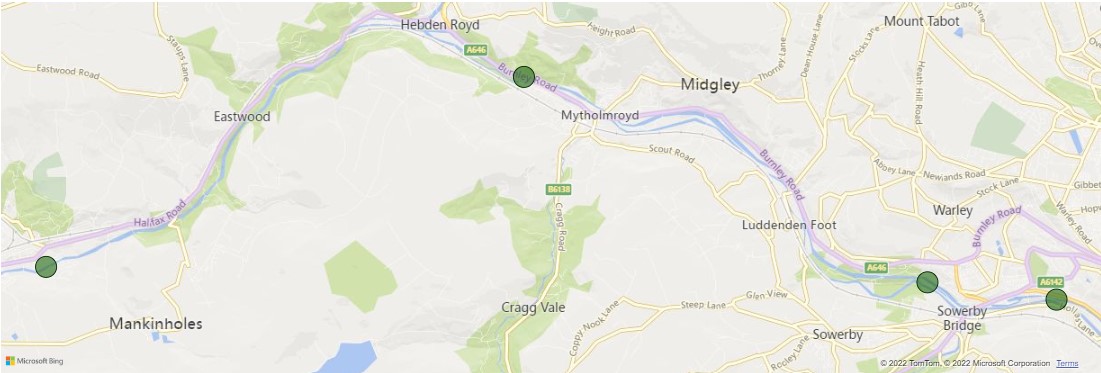
There is also a map visualisation showing the locations of each counter within Calderdale.
This dashboard is interactive, giving you the option to determine the detail you want to see on the dashboard. You can drill down further into the data either by, counter location or a specific time period. These filters will then change the visualisations to show the data related to each filter selection.
Data Works has twelve other dashboards, these can be found here.